How To Redesign and Update Your Home

Hello and welcome to the blog! Today I am sharing a client project I recently finished. This was such a fun project! It always helps when you have awesome clients! We took this outdated 1980’s home and breathed new life into it. It honestly feels like a new home! Today I’ll share some of before and after photos and links to the pieces we used to transform this home, and hopefully show you ways you can redesign and update your home as well!

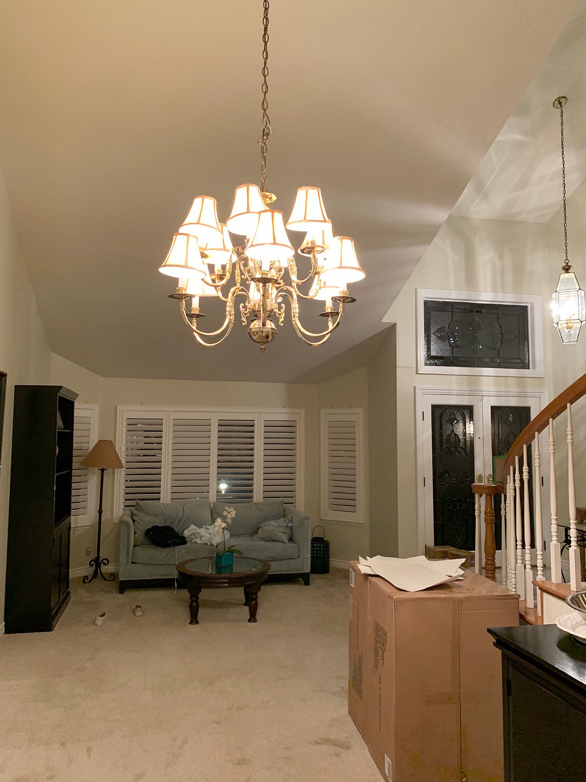
As always we first need to look at where we started before we can get to the pretty pictures. As I mentioned this house was built in the 80’s and really hadn’t been touched since then. The original owner was older and liked the house just the way it was. My clients are a younger family and the style just didn’t fit their taste, so an update was needed to help make their new home theirs. The first thing that stood out to me when I saw the home was the fact that it had so many different types of flooring. It made the house feel choppy and not cohesive.
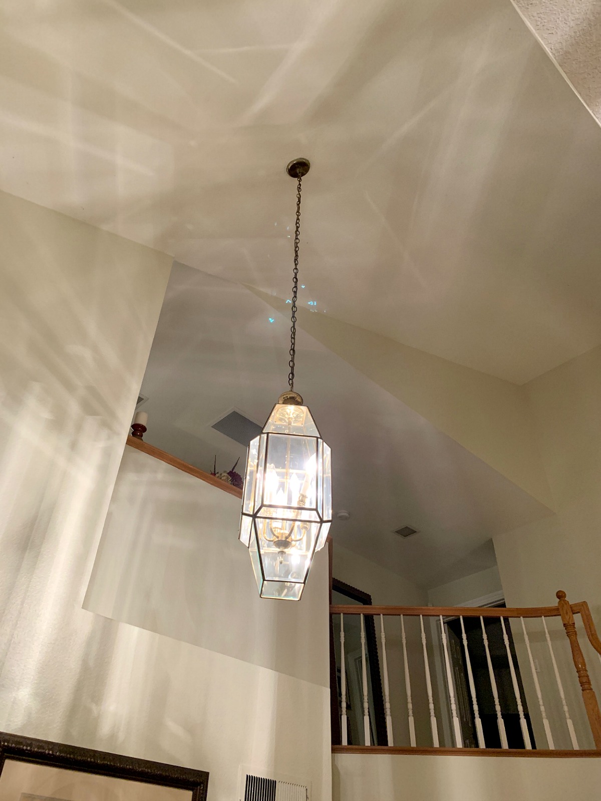
The second thing I noticed were the outdated light fixtures. They were original to the house and unfortunately didn’t have a cool vintage vibe! So within the first two steps into the house I knew flooring and light fixtures needed to be changed, and of course paint! If there is only one thing you can afford to do to your home to update it, let it be paint! Paint can transform and update any space and if you are willing to do it yourself, it’s very budget friendly.

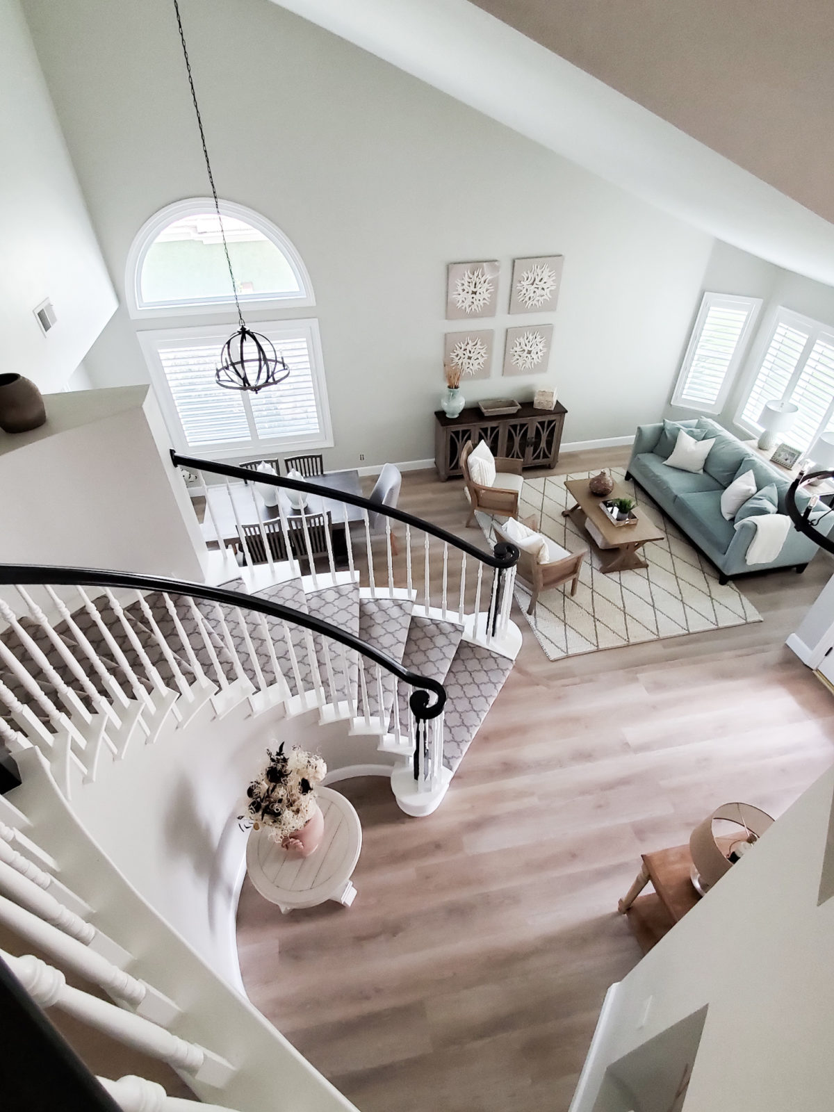
Ok on to some pretty pictures! For the entry and staircase we did a few things. First one being we painted the walls Porous Stone by Dunn Edwards. It is my absolute go to neutral paint color. My house is also painted this color. It is the perfect Greige and looks different in every room and space! We chose an eggshell finish which is the only finish I use. It’s not too shiny, but is still wipeable. We also painted the stair rail Black Licorice by Vista Paint. It is a nice dark grey. The stair spindles got a nice coat of white paint and that helped take the staircase into this century. Nothing says outdated like maple wood in my opinion. Round Table

The homeowners really wanted a pattern on their stairs. They choose Anderson Tuftex carpet with a Moroccan pattern in the color Greige. It gives their entrance a nice pop when you first walk through the door.

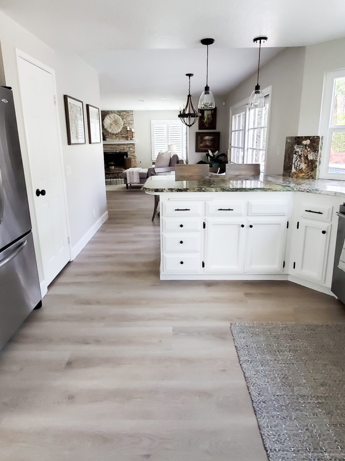
We also installed a new updated chandelier, and my favorite entry table the Everett Foyer Table. It is the perfect console table! We also installed new flooring. We chose this gorgeous neutral LVT flooring from Tecsun. The floor is from their Lighthouse collection in the color Grindel Point. It is a beautiful floor. It’s a nice neutral wood color with some grey undertones. It is just beautiful in person! We chose LVT flooring because of it’s durability. LVT is made to last and is waterproof. I still can’t get over how much brighter the house is!

I love how welcoming the entry is now in their home. Soon their front door will be replaced with an Iron Dutch Door From Pinky’s Iron Doors. Now that is just going to set the entry off!!

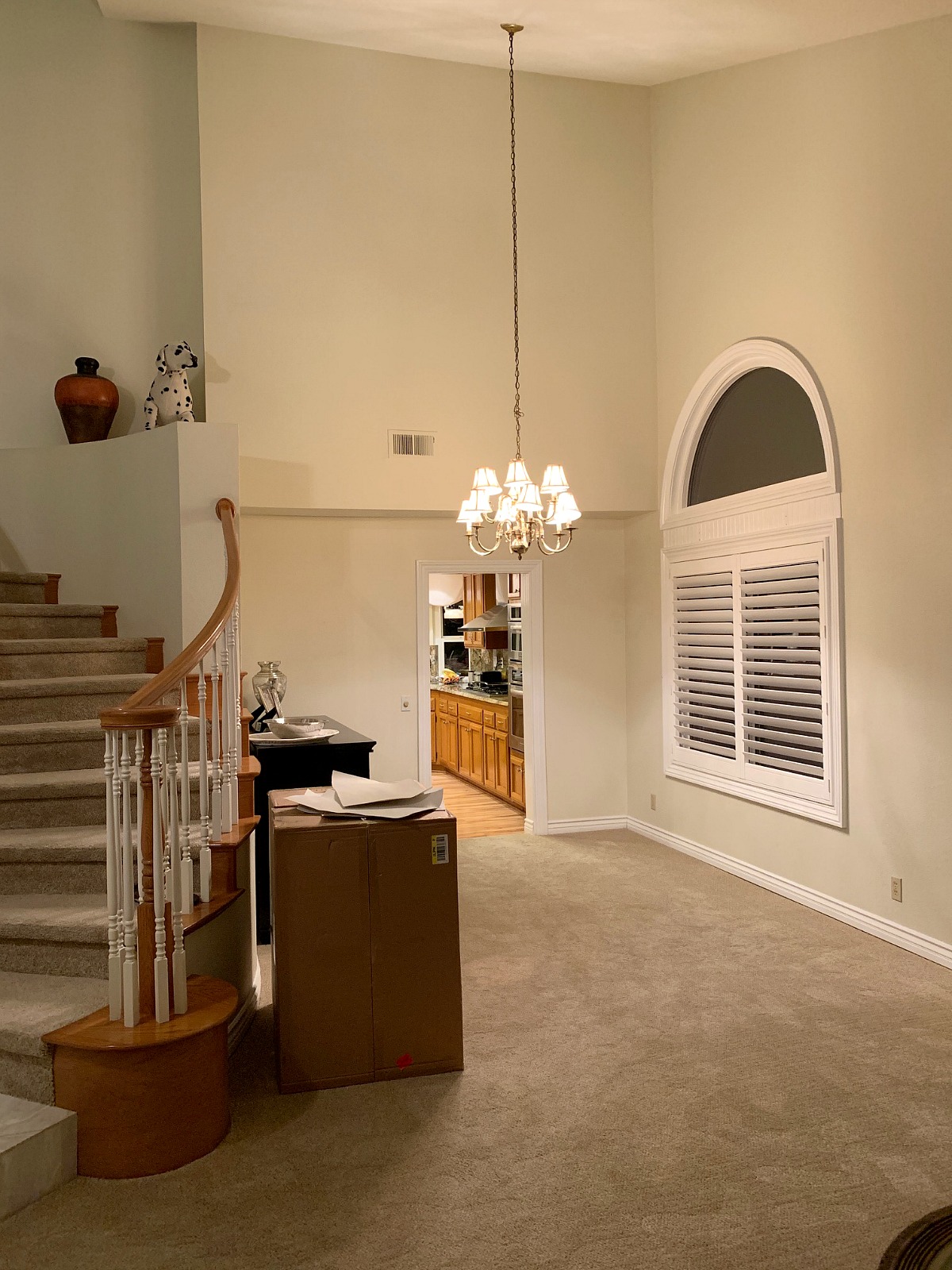
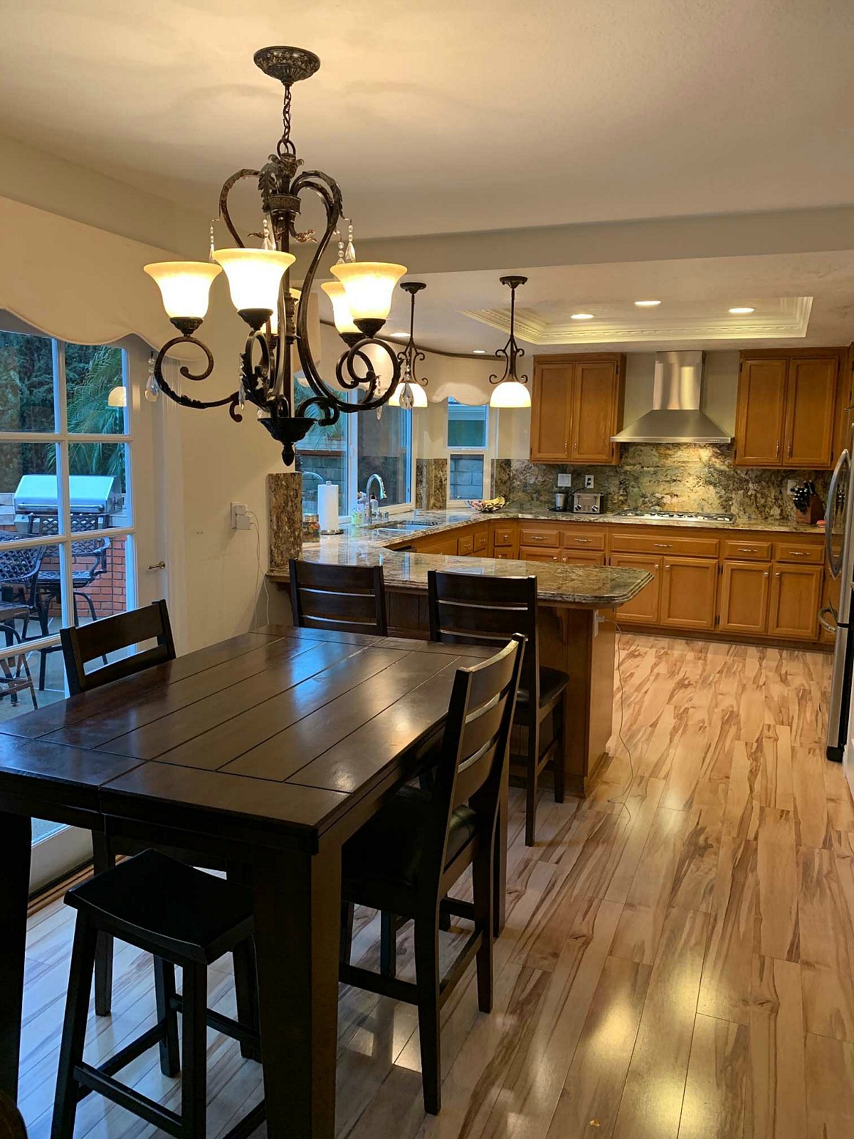
Just off the foyer is the dining room. My clients hadn’t been using the space. They weren’t really sure what size table would work in there. It is not a huge space, but there was definitely room to work with. I kept telling my clients that we needed to make this an adult house. I felt like there wasn’t enough seating for friends and family. They needed to have more areas for entertaining and socializing.
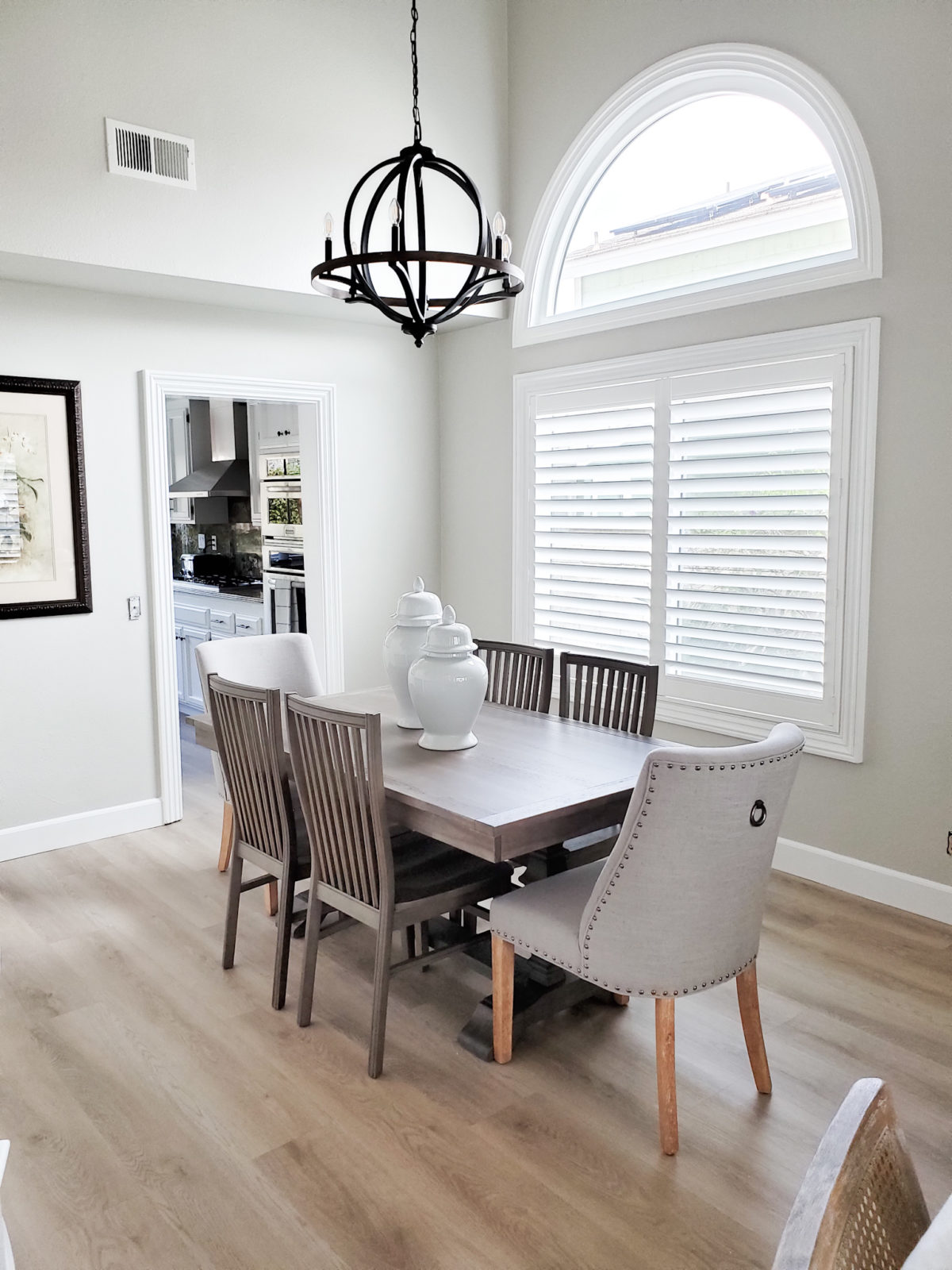
We added this cute Shadow Gray Dining Table from Pier One and new dining chairs. I always like to have my two head chairs be different than the other dining chairs. It just gives the space a little more interest. At first I thought we would go with different wood tone dining chairs than the table, but the more I thought about it, I felt the same color chairs were the way to go. I love these Shadow Gray Dining Chairs. The back detail is so classic. I also love the head chairs we chose. These Linen dining Chairs were the perfect addition to this dining table. Plus the bronze nailhead detail makes it feel a little more formal. And of course we had to update the lighting with a new chandelier.
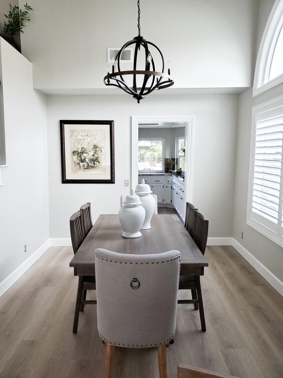
Since the dining room is not a huge space and has a walk through to the kitchen, finding the right size table was essential. The Shadow Gray Dining table is 66 inches wide and once we put it in the space it seemed like it was made to go there. I decided to keep the decor on the table simple with two ginger jars.
Directly across from the dining room is the front or formal living room. My clients really loved their sofa that they had in there so they wanted to keep it. It was in great condition so there was sense in getting rid of it. In this space they had an oversized hutch, sofa and small coffee table. Again I felt they needed more seating. You couldn’t really gather in this space, which is a shame because it’s a great area. The homeowner’s furniture was very oversized for their spaces. They had it all custom made for a previous home and now the pieces were just too big for their new home.
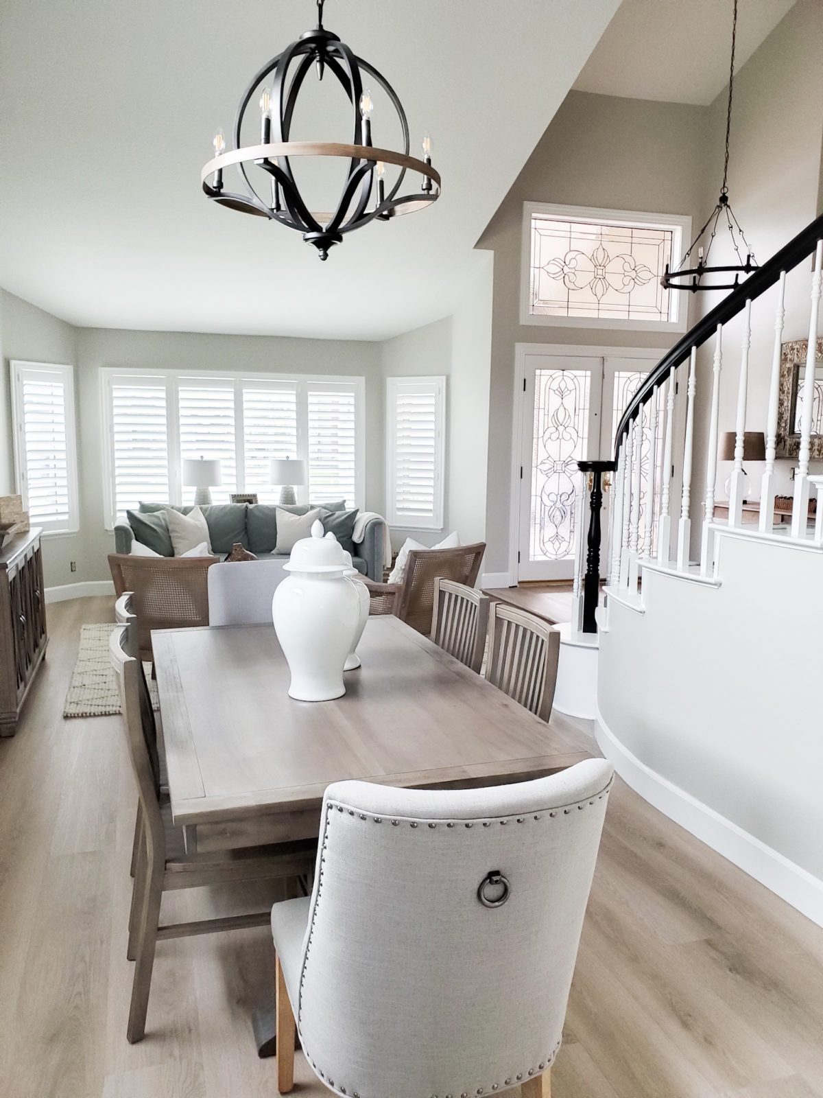
It is quite a different view from here now!! When you walk in you see both the entry chandelier and dining chandelier, so it was important those two complimented each other. When you have a space like this where two light fixtures are seen together it is important to make sure they look good together. I accomplished this by making sure the dining room chandelier had black metal just like the entry chandelier and the fact that they are both round helped too.
Now this is what I call a grown up space. There is plenty of seating to entertain and socialize in this space now. Even though there is actually more furniture in this space, it feels bigger than it did with less. It is all about using the right scale of furniture in a room. This room isn’t huge, so we weren’t able to use huge pieces. We needed to stick with smaller scale pieces with clean lines. We added two accent chairs. I was drawn to the neutral wood tone and cane detail. Next, I found this cute coffee table. It is a small scale coffee table yet is still a good size. It complimented the chairs and sofa perfectly.
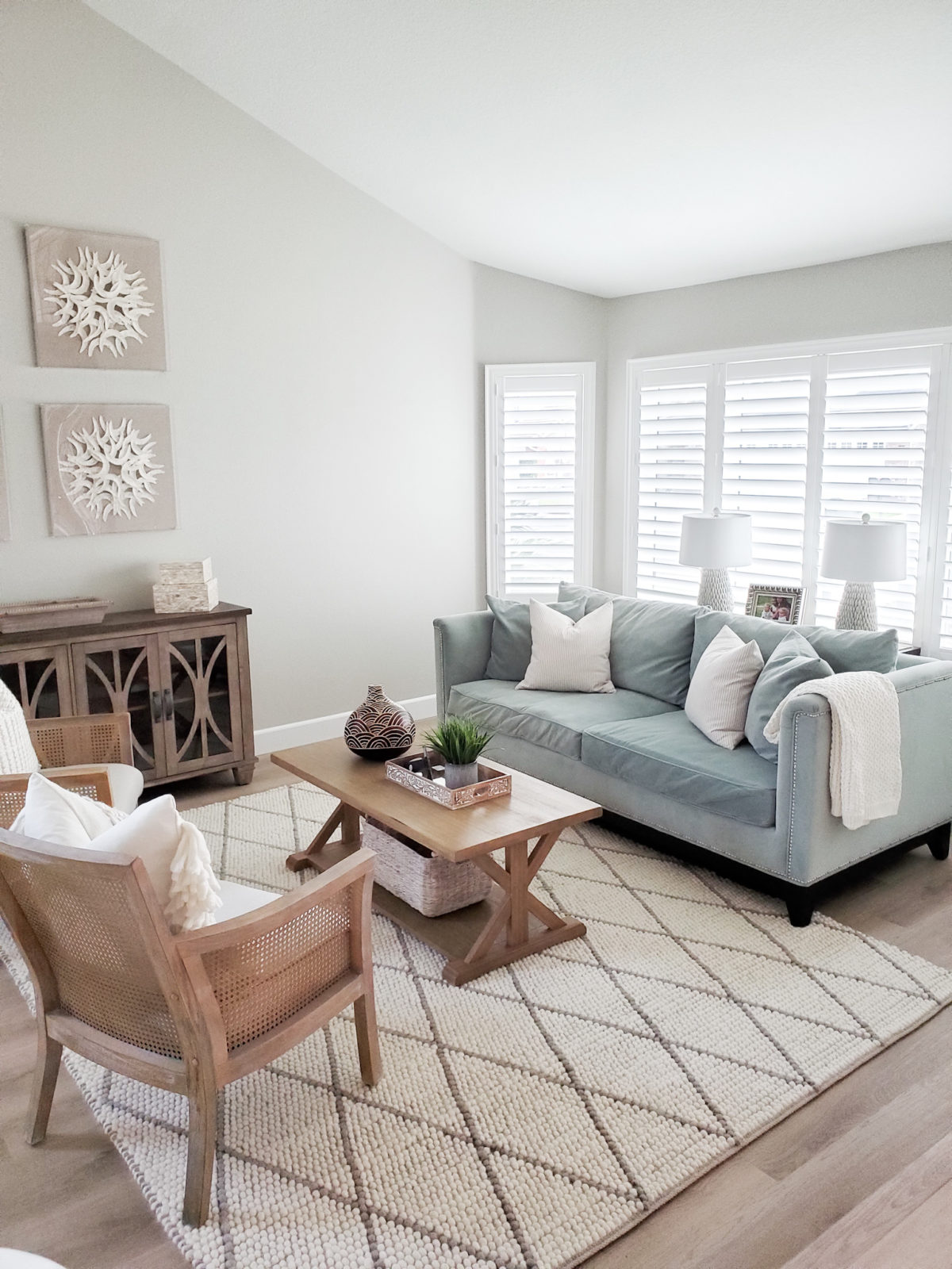
I brought in some auqua teal accent pieces to help tie in the sofa, and added neutral pillows to the sofa to make the space feel cohesive. I also placed a cute ivory throw on the sofa to help tone the color down a bit and tie it in with the throw pillows on the accent chairs. Of course the room needed a rug! Rugs are the best way to help define an area. If there was no rug and no rug in the dining room there would be no visual separation. It would feel like a hodge podge of furniture. Luckily we found this great neutral diamond trellis rug. It went perfectly with the furniture.
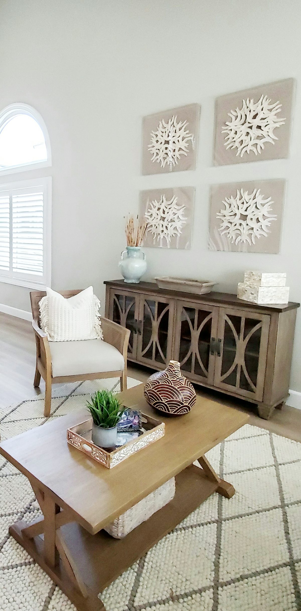
The ceilings in this room are very high which is great. Whenever you have high ceilings it is always nice to go higher up the wall with your wall decor. Take advantage of those high ceilings and make it more of a feature. By hanging higher wall decor on the wall you are making your eye look higher up too, and people will really notice the high ceilings. I found these beautiful Paper Cotoure Wall Art at a local shop. They had the perfect colors for the space and since there were four, I new I could put them together to make a statement on the large wall. My clients found the console and it also worked perfectly in the space and gave them added storage.
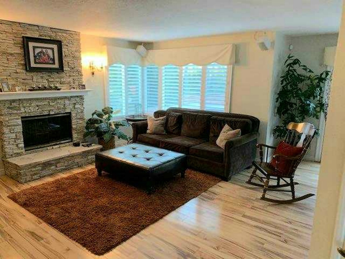
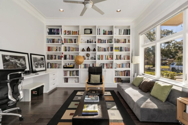
Lets move into the other half of the house shall we. This is the family room. This is where the family spends the majority of their time. Again I was surprised to see such little seating lol! I asked my client where she sits when they have company and she said on the fireplace hearth! So I knew we needed to change that.
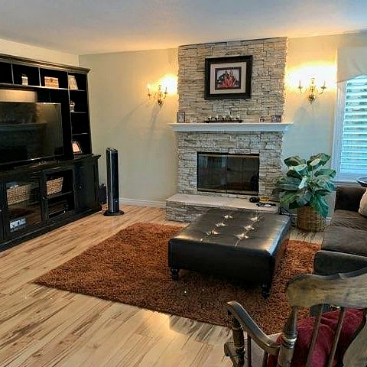
Again they had large scale pieces in this space. The room is not too large, but with the large media unit and oversized sofa it felt very tight. I knew if we scaled down the furniture sizes we could fit more seating.
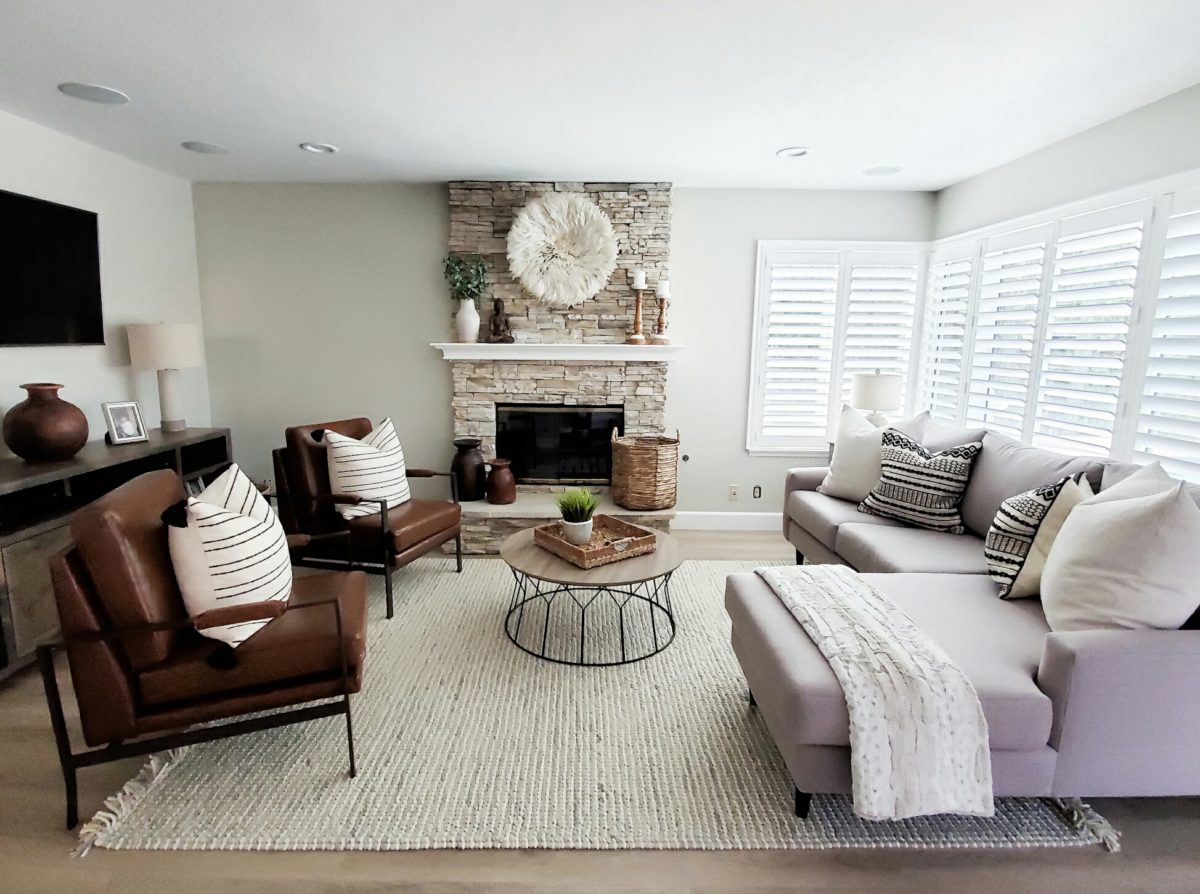
The first item I found and purchased for this space was the cream juju hat. I knew it would look great on the fireplace. It goes perfectly with their stone and added a nice pop of texture. I was so happy the homeowners were on board with it! I styled the mantel and hearth with items my clients had already. I added a large basket to store their electrics when they weren’t using them. My clients really wanted a chaise sectional and had a custom one made from Cool Sofas. It looks perfect in their room. 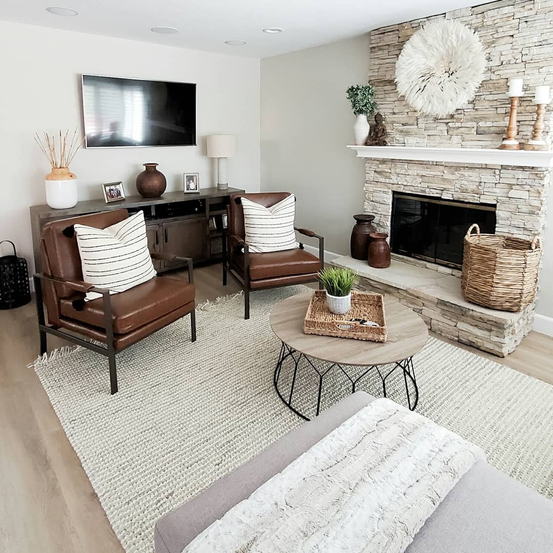
I decided to go with a round coffee table. A round coffee table gives more walking around room in a space versus a rectangular one. I found these leather chairs online for a great deal and my clients loved them! They are the right height to be placed in front of the TV and are very comfy. They added some different texture to the space too. We toped them off with striped pillow covers. The rug I chose for this space is a great neutral rug. I have it in my home as well, and as soon as I saw the room coming together I knew it was the perfect rug for their home! It grounds the space and adds some softness.
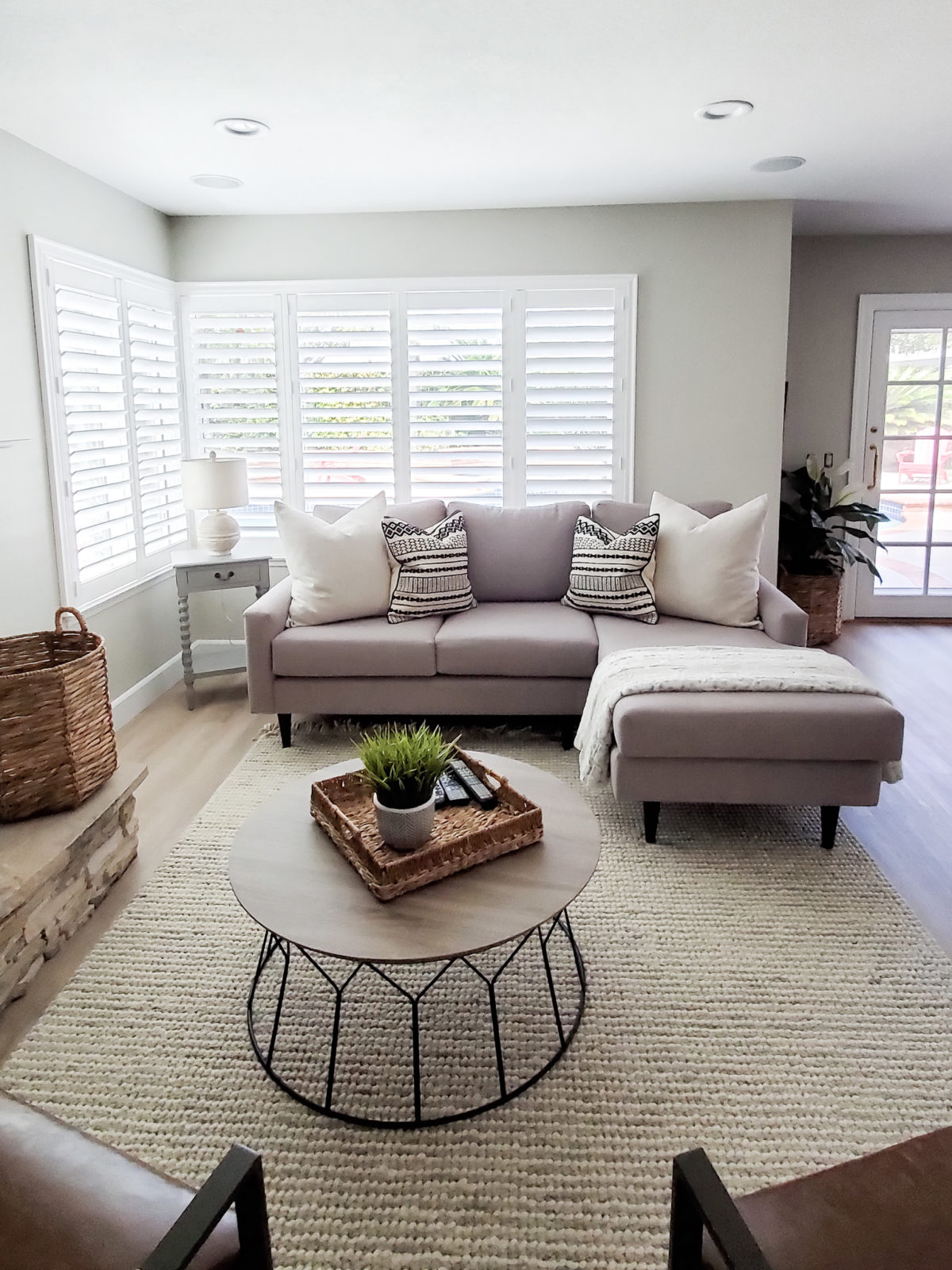
The custom sofa my clients had made is really great. It is perfect for the space and they love that it has a chaise for extra seating. With the fireplace hearth being where it is we couldn’t center the sofa on the window, because then the rug wouldn’t be centered on the sofa. So I did a quick run to Homegoods and grabbed a cute side table and lamp. It helped fill in the space on the left and made the sofa look better not being centered under the window. I also found those black and white pillows from Homegoods and the throw blanket. I think every sofa needs a good throw blanket!
Just off the family room is an eating area. The dining set my clients had was a bar height set. The ceilings in this part of the home are only 8ft so with the tall chairs and table plus an oversized chandelier it just made the space feel tiny and the ceilings felt so low.
We found the perfect round table from Pottery Barn and chairs. The table is the right size and the best part is it can also expand. So when they have guests over they can extend the table. Changing out the rectangular table for a round one freed up so much room. Now you can easily walk around the table and pull out the chairs with ease. We also replaced the oversized chandelier with and updated smaller one. That also made the space feel larger and the ceilings feel taller.
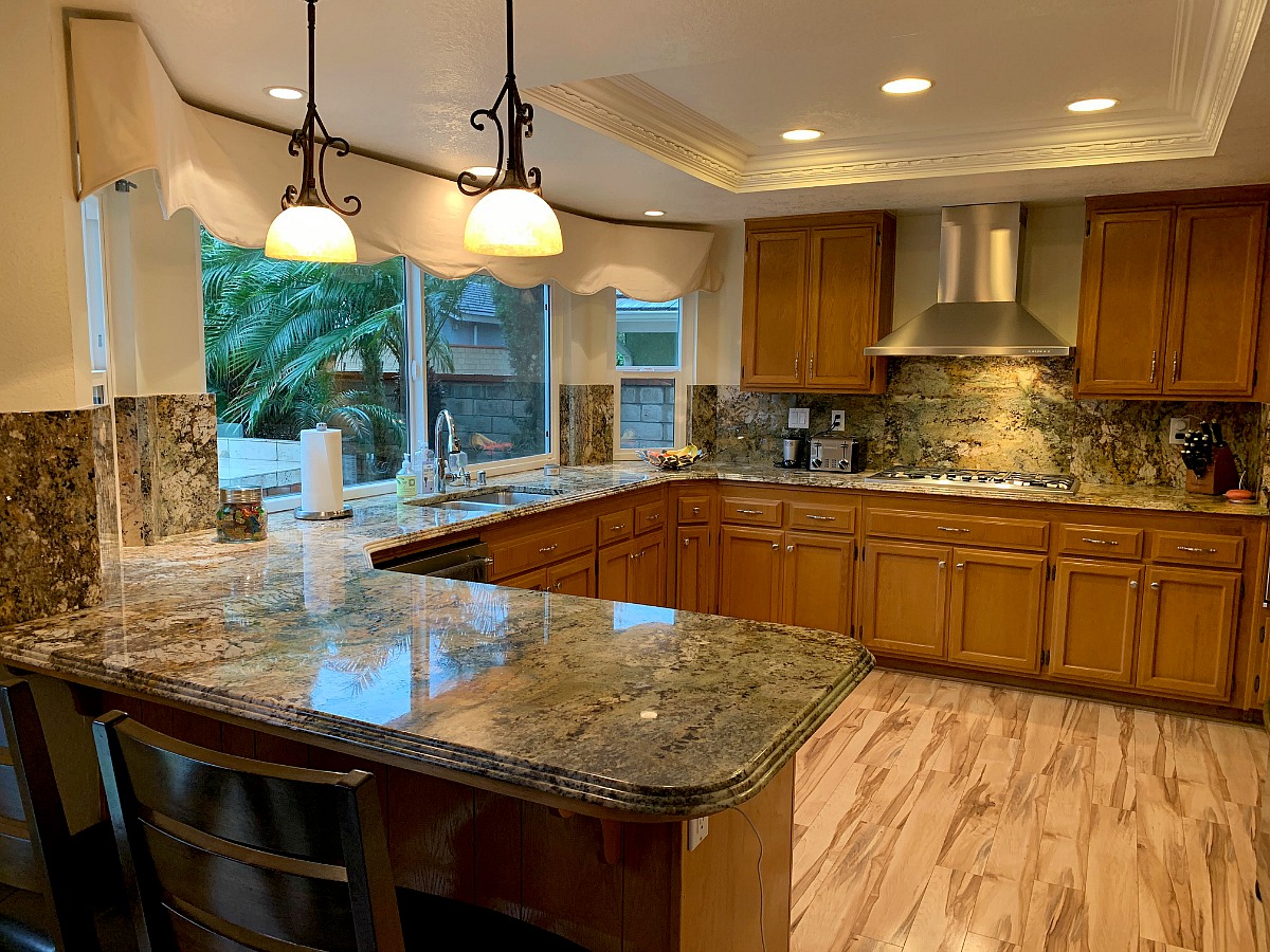
Alright onto the kitchen! This is what the kitchen looked like before. The appliances were very nice and updated, but they were being overshadowed by the outdated cabinets.
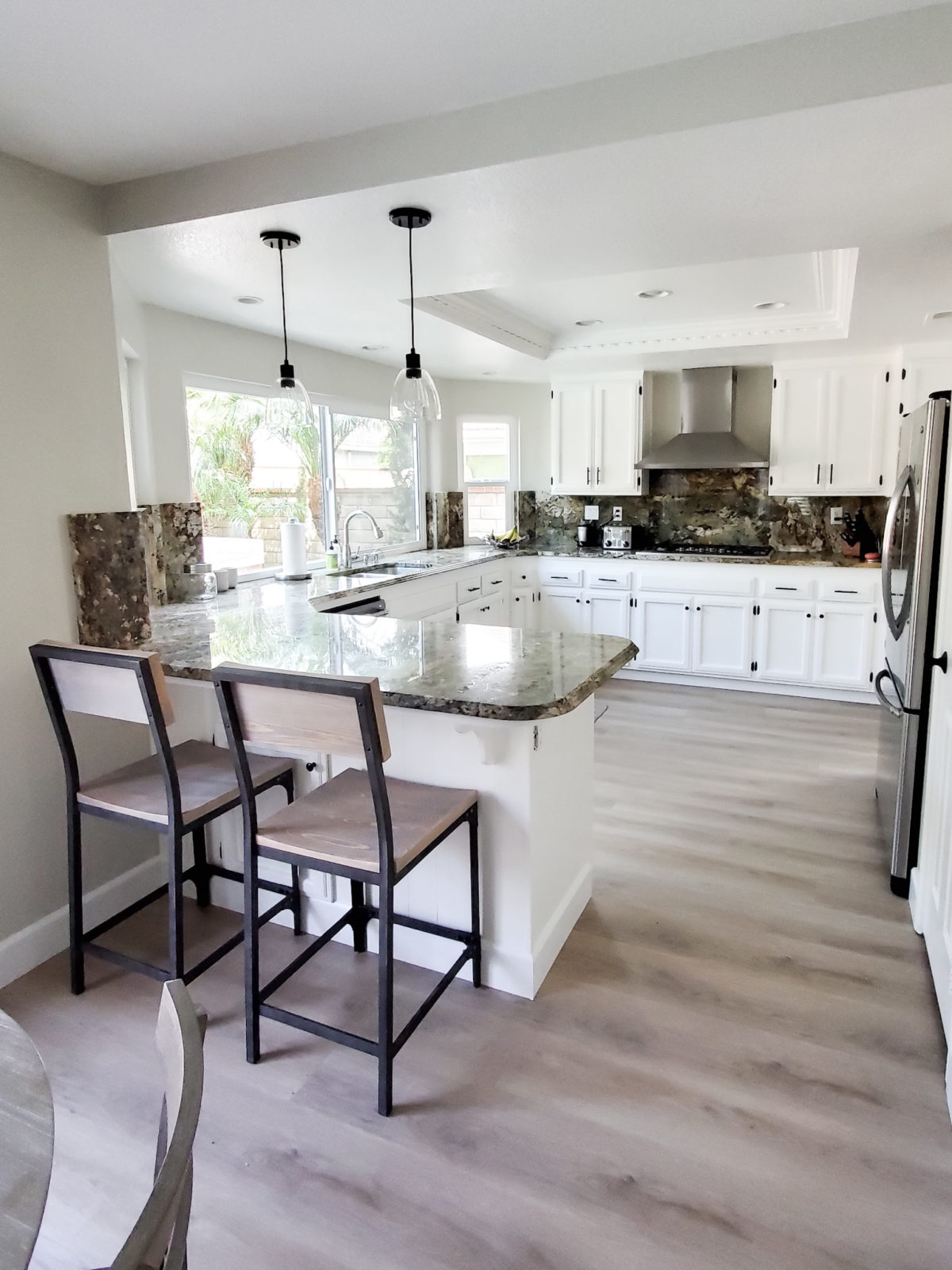
Voila! What a change right!!! All we did was paint the cabinets Simply White by Benjamin Moore and changed out the hardware to more modern black handles and knobs. There wasn’t enough money in the budget for a complete kitchen remodel so painting the cabinets was the most cost effective choice. Even the countertops look better with the white cabinets. We also changed out the bar stools for some new modern ones and updated the pendant lights.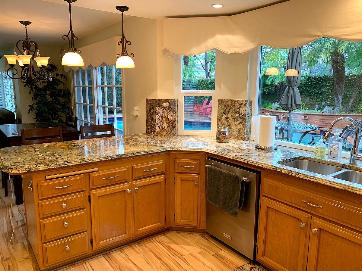
The old kitchen felt dark and screamed outdated. You didn’t even notice the nice appliances or large windows.
After we painted the cabinets the kitchen felt 50% brighter and bigger! It just brought new life into the space. This is why I will alsways be a believer in the power of paint!! It can take any space from drab to fab! We also added a cute rug under the kitchen sink.
Well there you have it!! That is how we transformed this 1980’s home! It is a beautiful home and most importantly my clients love it and it fits their style. There is nothing better than living in a home that feels like you. I hope this has inspired you and has given you some ideas on how you can redesign or update your home. Thank you for stopping by the blog and please make sure to subscribe so you don’t miss a post!


What a great transformation!
thank you so much Jessica for your feedback!